The polarising mid-century style is making a resurgence in the great indoors
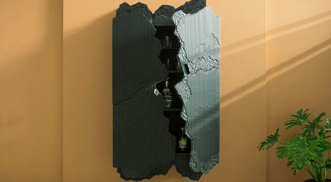
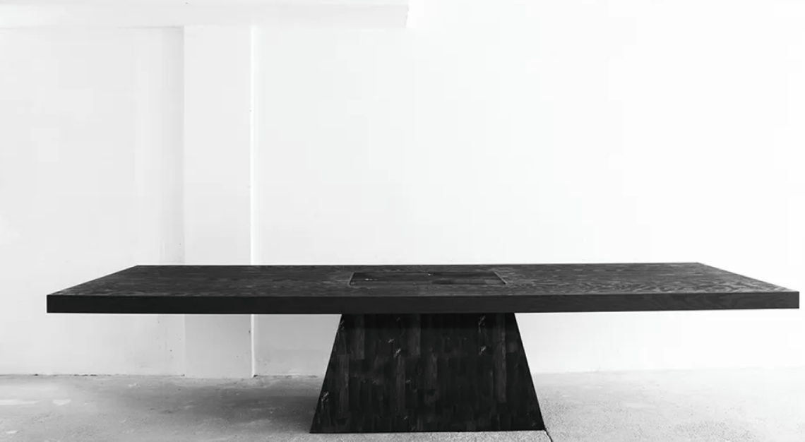
Brutalism is back—and softer than ever. Marked by a stark, materials-forward palette and an imposing sidewalk presence, this mid-century aesthetic is arguably one of the most divisive architectural styles and a longstanding source of conflict in the design world. Some praise its modernist language and experimental forms, while others find its buildings heavy and oppressive. Recently, it has reemerged with an elevated twist: No longer reserved for civic and institutional structures, brutalism has become a popular playground for many practitioners, from furniture makers to interior designers. Blocky silhouettes and bulky geometric shapes are cropping up in residential and commercial projects alike, but designers are softening the overall look with natural textures and elegant materials.

Brutalism emerged in Europe after World War II and rose to prominence in the 1960s, its popularity continuing through the 1980s. The style became a signature of the latter half of Swiss-French architect Le Corbusier’s career, the most well-known project being Unité d’Habitation, a high-density housing complex in Marseille. Other celebrated examples are London’s Barbican estate, Habitat 67 in Montreal, and the Geisel Library on the UC San Diego campus.
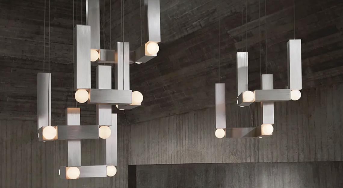
While it’s easy to see how béton brut (French for “raw concrete”) can be off-putting in its original form, designers are now reinterpreting tenets of the style—simple sculpturesque forms, lack of adornment, architectural details—for a broader appeal. And it’s proving popular. After more than a decade of bright whites and pastry pastels, new brutalism is grounding. It brings about a sense of rootedness with minimal glamour. Geometric furniture upholstered in materials including mohair, linen, and velvet (take Pietro Franceschini’s Vitamin collection for Monde Singulier or the H Chair by Estudio Persona) or executed in subtle finishes, such as the brushed aluminium of Lee Broom’s Vesper lights, bring the look into very livable territory.

“I think about it in terms of a wabi-sabi brutalism,” says Ygaël Attali, founder of the international contemporary-design gallery Galerie Philia, which is known for its roving, site-specific exhibitions and A-list roster of designers and artists including Franceschini, Rick Owens, and Studiopepe. “There is the geometry and minimalism from brutalism, but people want warmth and softness in their homes, and that [feeling] comes from natural materials and colour palettes. There is more emphasis on human touch.”

For purists, fear not—concrete has not gone by the wayside. Andrew Trotter, a Barcelona-based designer and founder of multidisciplinary firm Studio Andrew Trotter, integrates many elements of brutalism into his work. In his 10AM event-space project in Athens, Trotter kept the 1960s-era building’s existing concrete, layering in gauzy curtains, wooden furniture, and white paint for a look that balances Scandinavian softness with basement-bunker blues. The coffered-concrete ceilings are original, but their texture relaxes the scheme and adds visual interest to the otherwise minimal space.
“We are seeing a new love for many past styles,” Trotter says. “Brutalism from the ’60s and ’70s is one that a new group is discovering, and modern architects are bringing it into a new era. Brutalism is exciting, but you have to be brave.”
This story was first published by Robb Report USA. Featured photo by Monde Singulier


