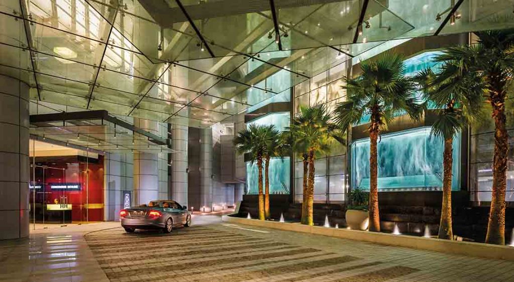
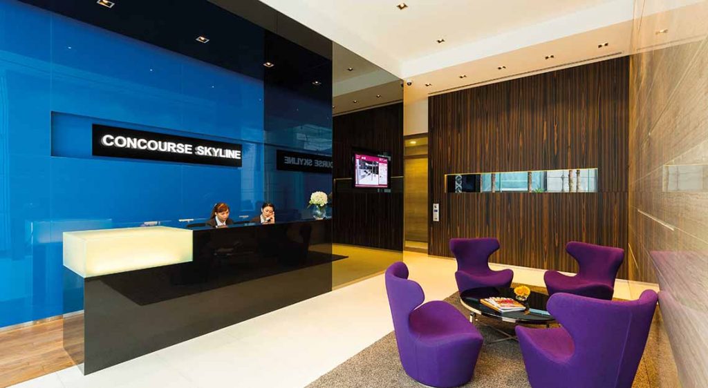
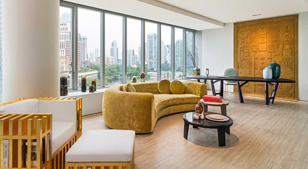
Framing the million-dollar view of the Singapore skyline, the Concourse Skyline Penthouse by Robb Report is an exercise in elegance and refined living. We speak to The ID Dept, interior designers of the Penthouse, on what it takes to deck a dream home with a stunning panorama
When it comes to designing your dream home and filling it with furniture and artwork, the important questions are invariably linked to time and budget. Then, the next big consideration is: how much is too much? Robb Report Singapore speaks to Divya Anthony (DA), design director and Fiona Ho (FH), associate design director, both from luxury interior design firm, The ID Dept, on what it takes to ensure you’ve struck a balance.

What are some misconceptions that clients have when it comes to designing large spaces?
DA: A room should never be full of furniture when you first move in. As you travel, you’ll collect items. It’s an accumulative process over time. Start slow; get the bare essentials like a dining table, dining chairs and a sofa. Your lounge chairs and side tables are add-ons. They can be eclectic pieces that give character to a space. Some of our clients also send us pictures sometimes, and ask if a particular item would work in their current home design.
How do I decide on the right amount of furniture for my living room?
FH: The number of seats in a living or dining room is often dictated by the number of rooms you have. For a three-bedroom home, you’ll need about eight seats. That’s one big sofa and two lounge chairs. It shouldn’t be overcrowded. Despite having only two bedrooms within the Concourse Skyline Penthouse by Robb Report, we set up a seating space for at least 12, given that the owner will likely host regular parties.

For rooms that come with a stunning view, how do you ensure that the panorama is not overshadowed by the decor?
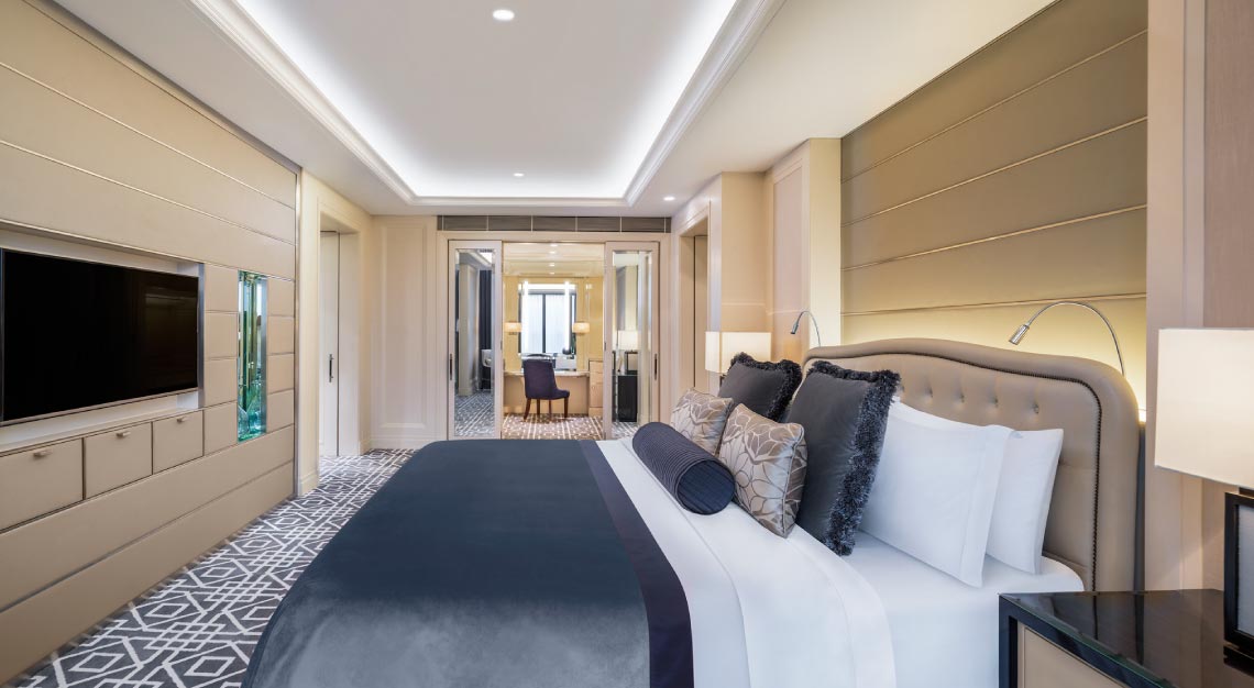
DA: A room with a view has two looks: a day scene and a night scene. During the day, you see everything. At night, the mood changes. You’ll see the twinkling of the lights, and the decor of the bedroom comes alive. Use neutral tones for the bed, headboard and bedroom bench. Pastel colours work as they won’t fight with either view. Interior lighting is important.
Panel lights provide a soft glow and they don’t fight with the light coming from outside. The magic in the Penthouse’s master bedroom is the artwork that sits behind the headboard. The unique art deco-style wallpaper is a collaboration between Giorgetti (provided by Space Furniture) and de Gournay (provided by Tatum). But you don’t notice it when you first enter the room. You’ll first see the view, and it’s only when you turn your head that you’ll then notice the wallpaper.
How do you help clients narrow their ideas down to form one big picture?
DA: Today’s clients know their design and what they like. Everyone’s pretty tech savvy, and they often use Pinterest and Instagram for ideas. They’ll come to us with images they like. Clients may show us 10 pictures with 10 different looks, but in every image, there’s usually just one thing they like. It could be the colour scheme or the wall texture. It’s knowing what exactly the client likes, and then working around it.
How do you improve a space that does not have an impact?
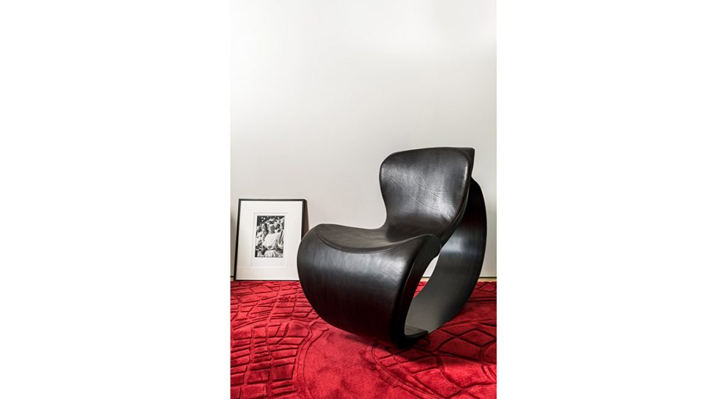
DA: It’s all about the journey and making an entrance. If your ceiling isn’t high, you can elongate the space by placing mirrors in the ceiling. You can also think about using a statement piece, be it a piece of art or furniture to grab the attention when you walk in.


Would you recommend customising pieces for homes then?
DA: It depends on the space, as that dictates the items you’ll be need. In the case of the Concourse Skyline Penthouse by Robb Report, it has a coastal view. In the living area, we asked Lasvit to design a bespoke crystal chandelier that sits above the grand piano. The finish on this is pearlised to reflect the mother of pearl sheen seen in oysters. It’s a subtle representation of what the view is about.
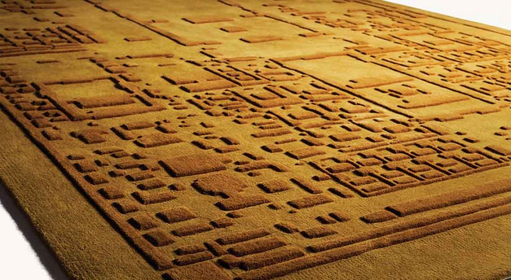
FH: It’s also about being able to see the product for different purposes, apart from what it was intended for. For example, for the Penthouse, we took a rug from Affluency, and turned it into a backdrop of a wall.
Is there an underrated space that homeowners should pay more attention to?
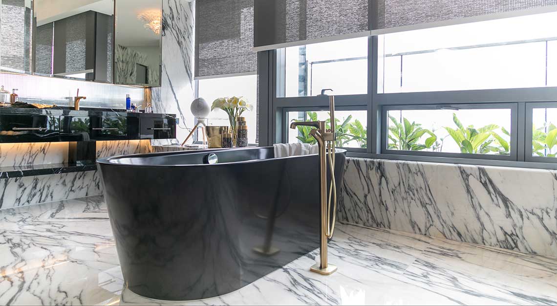
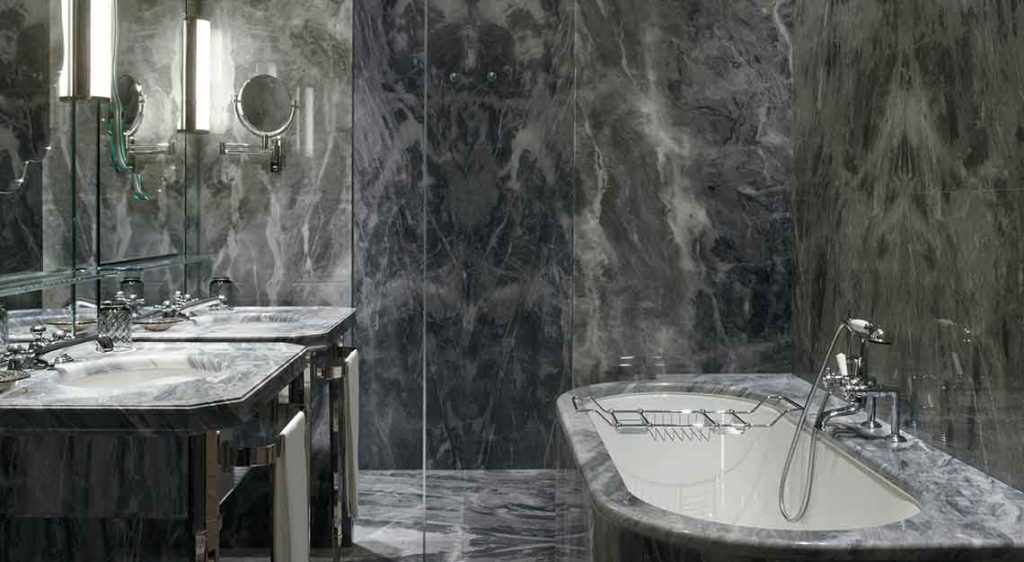
DA: The bathroom, definitely. Have you been to a hotel or a restaurant, and your friends go, “You need to look at the bathroom?” It happens all the time. They talk about the mirrors, the seating area – that is a talking point. We worked with Gessi to do up the powder room in the Penthouse. There’s a wall of chandeliers in there. We already have Lasvit’s cascading chandelier in the living area, so this is a different kind of ‘drama’ that catches people’s attention.
How far would you push a conservative client to be adventurous?
FH: In one of our projects, the client wanted something toned down and neutral. We kept what she wanted, but we also put in a huge 1.8m ostrich feather lamp in the corner. The client loved it because the room, while kept simple, had a hint of surprise and playfulness.
