Follow these uncomplicated design tricks that can help to make your living space look bigger, cleaner and more luxurious
Interior design tips and inspiration available online may easily be accessible to everyone, but no one truly understands your design palate like an expert interior designer does. Case in point: renowned British interior designer Katharine Pooley. Pooley has been the go-to designer for numerous iconic figures across the globe, simultaneously overseeing her team of 47 interior designers and architects. Lauded for her ability to immerse herself in every detail of her client’s complex projects, Pooley continues to expand her loyal international fan base with projects in North America, Middle East and Asia, and has recently opened a flagship showroom in Doha.
So in a city like Singapore where many struggle with storage, what makes a well-designed living space, and how does one live with the shortcomings that come with any space? We sat down with the eloquent businesswoman last April and posed the question on her.
What is the importance of choosing the right fabrics for a living space?
In the process of designing a space, I don’t normally start with fabric. But sometimes, it’s the fabric that dictates the style. For instance, in the living room, I’d start choosing fabric for the sofa first as it’s usually the biggest furniture you’d see on a blank canvas. I recommend steering clear of cream-coloured fabric for the sofas as it tarnishes very easily when in contact with jeans, or denim in general. The fabrics that I use are typically scotchgarded so that stains can be removed easily.
What kind of fabrics work well in the living room or master bedroom?
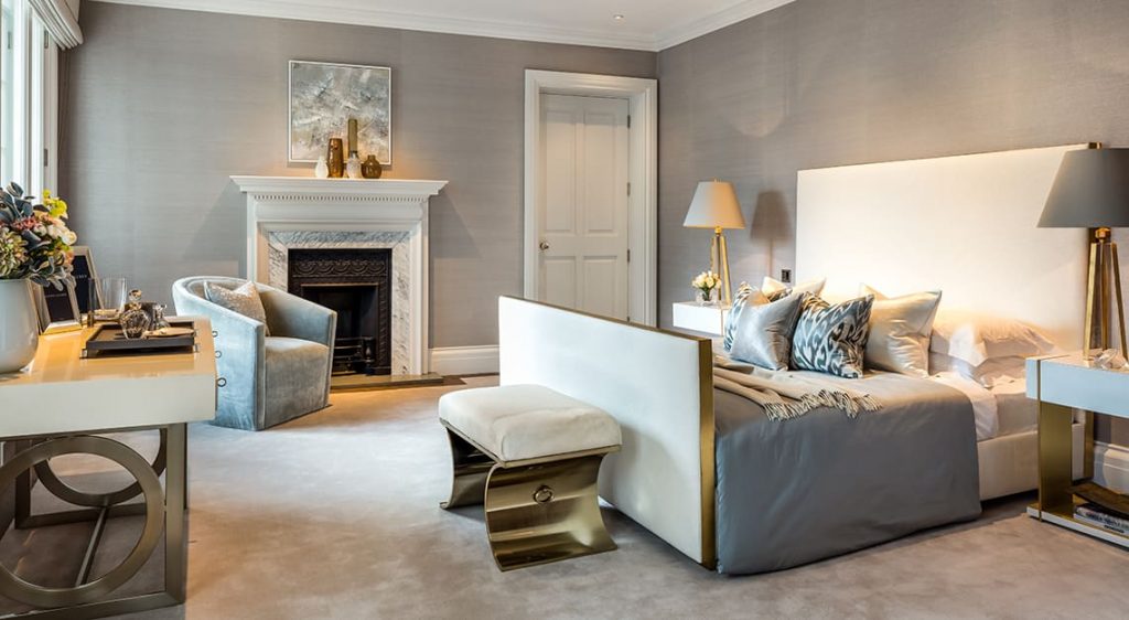
Brushed cotton and velvet make excellent fabrics for the master bedroom headboard because of its durability. One can afford to use more delicate materials, such as silk, for bedsheets. That said, silk, however, isn’t an ideal fabric for furniture items that can be sat on, such as chairs and sofas.
What colours work well in a small living space?
There is no right or wrong when colours come to play, whether it’s for a small or big living space. You can have a small apartment and have really dark steel blue sofa paired with yellow cushions – I think that would look stunning. The intensity of colours will also not make a space look smaller or bigger. For instance, most people have the misconception that white is the best colour for small spaces, but that’s not the case. It’s the individual’s style and personality that dictate the choice of colours.



How would you spruce up a technology-focused living space to make it look more cosy and homey?
All my clients are quite tech-savvy this days, but these technological items aren’t overly obstrusive and typically don’t affect the design of the space. In fact, you can have a classical house with technical capabilities. I would say that it’s the type of decor and fabrics used that make a space look cosy and homey.
What is the most fascinating technological feature you’ve ever seen in a home?
I once designed a house in England for a sportsman who is very tech-savvy. He wanted a beautiful outdoor garden with a massive outdoor cinema, so I found him the world’s largest outdoor TV, the C Seed 201 designed by Porsche Design Studio. At the touch of a button, the TV rises from underground and unfolds to form a massive 160-inch screen. But after much consideration, he didn’t purchase the TV in the end – reason being England has a lot of rain, so he didn’t go ahead with the idea of having an outdoor cinema.
How do you begin the process of picking furniture for a living space? Do you start filling the room from the middle or the corners, for instance?
I don’t actually start from the middle or corners – everything should come together harmoniously at the same time. When designing a space, we begin with floorplans as they help us visualise where all the furniture items will sit. That said, comfort and precision are my priorities when picking furniture. Finding furniture of the right size is important; you wouldn’t want a chair or dining table that’s too high or too low for your liking – it compromises comfort.
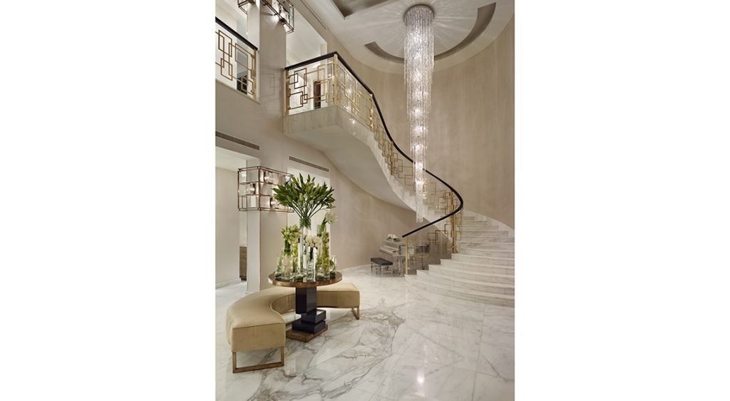
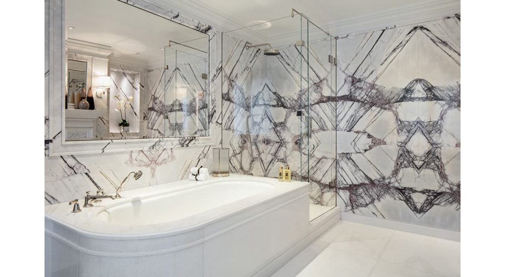
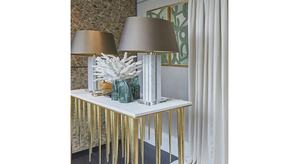
Share some design tricks that can help create the illusion of space.
Mirrors, of course. In this day and age, there is a vast range of mirrors to choose from to make a space look bigger. I would always integrate them into the space. That said, if there’s anything in your room that you think is a waste of space, like an unpleasant-looking wall or pillar, my advice is to address it immediately and turn it to something beautiful. You’ll be surprised at how well it integrates into the design of the room.
What are the most clever storage features you’ve ever seen?
I recently designed a kitchen for a client, and I wanted to employ the Japanese concept of ikigai, which means that every item or object belongs to its rightful place. For this kitchen, I compartmentalised as many kitchen tools as possible and integrated them into the design of the space. For instance, I integrated a step underneath the kitchen sink, so the little ones can simply pull it out on their own and step on it to wash their hands.
I wanted a clean kitchen surface too, so food preparation materials like tin foils and paper towels are stowed in a cupboard just next to the sink. Another cupboard by the sink is dedicated to all things breakfast – that’s where the toaster, jam and butter hide. My favourite feature would have to be the thin sliding drawer hidden beneath the counter top where you jam your toast; it comes with a brush for you to remove all the bread crumbs, so you don’t end up making a huge mess!
